


What’s different about Mobile websites?
The way a website appears on smartphones and tablets is different to a desktop, and the way they are used is different too. For example Mobile can be exactly that, used in transit. Noone is ever moving around when accessing a website on a desktop computer. But your website visitors using a mobile device could be on a rickety bus journey, holding shopping in the other hand, or in an area of patchy internet connection. A badly designed website can be a mere annoyance sitting at a desk with a PC, but for a mobile user it can destroy a potential customer’s willingness to ever visit your website again.
There are many different types of device out there with many variations of screen size, resolution, in portrait and landscape and it’s difficult to design with all these variations in mind. But it does all boil to the concept of Responsive design. Bad design is amplified on mobile devices, so keeping things uncluttered and simple will lead to a good user experience on most devices and mean a user is less likely to miss-click or tap one a button that’s too close to another.
Mobile Friendly design
The biggest sins when forgetting mobile users tend to be to do with the size of the screen and the ability of a website user to access the content.
Clickable elements displayed too close together
There’s nothing worse than trying to click a link, or button that’s too small and clicking the wrong thing. This happens to even the most nimble fingered user, it’s very frustrating for mobile device users, and clearly not a good user experience.
Supporting only one image resolution
This is usually a technical setup issue. But displaying images or text that won’t resize to fit a mobile screen will lead to the worst visitor experience ever, with images and text that must be scrolled passed or around to access the site. Only the most die hard user will try to access a website in this state.
Forgetting About the Search Bar
This is the safety net of websites that have a lot of content but the architecture is challenging or the navigation options are complex on a mobile device. A search bar can mean the difference between a member accessing the content they need or give up and you lose their attention and retention.
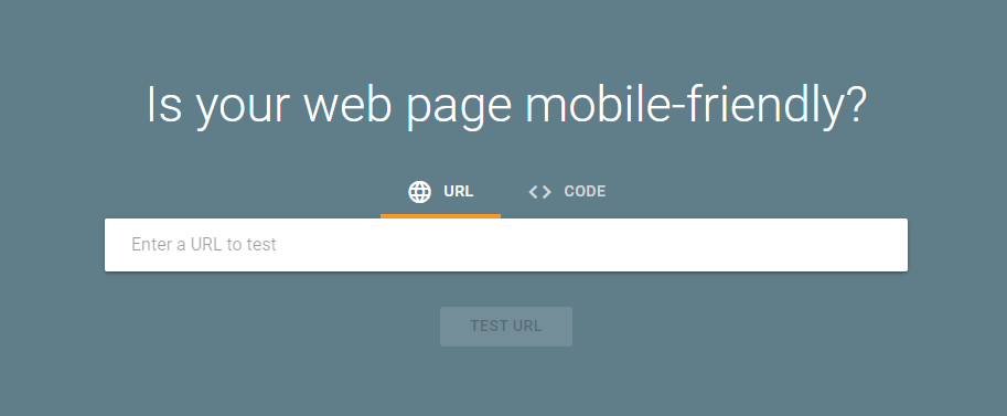
How to use Google’s Mobile-Friendly Test
Okay this Quick win is a lovely simple one to try but the interpretation may require a bit more knowledge, so let’s start with how to use Google’s Mobile-Friendly test tool.
Go to the test tool page: https://search.google.com/test/mobile-friendly
Enter the URL of the webpage you want to test and click go!
Mobile-friendly test results
Page is usable on mobile
The score you want to have is “Page is usable on mobile” this means your page has passed Congratulations your website is a great place to be for mobile device users, there may be a few minor issues which won’t show in.
However, the following mobile friendly test results are also possible:
No data available
Ok, that is not good, hopefully the tool is having an issue, otherwise you might need to contact your tech team.
URL is not available to Google
Are you trying to test a page that isn’t published or public? Google can only read pages that it can access with its robot crawlers.
Page isn’t usable on mobile
You have failed the test, there are one or more issues that mean your website is not Mobile friendly and will provide descriptions of the problems.
Did your website fail the Mobile-friendly test?
Don’t worry, Lighthouse can help you fix your mobile issues and you will notice the difference straight away. More visitors, and more conversions.